Branding and Interactive

Tri-State Christian
Tri-State Christian is a designed concept web platform to connect Christians in the Tri-state area (New York, New Jersey, and Connecticut) with local Christian charities that align with their values, passions, and spiritual callings. The website is designed to offer a searchable directory of vetted faith-based organizations across various causes—such as homelessness, youth outreach, missions, education, and crisis support—allowing users to discover opportunities for giving, volunteering, and partnership. Through personalized filtering, community reviews, and resource-sharing tools, Tri-State Christians empowers believers to live out their faith through meaningful action while strengthening ties within the regional Christian community.


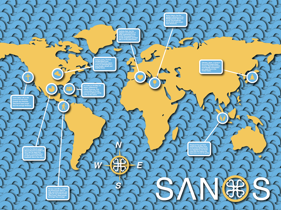
SANOS
Inspired by the Blue Zone brand, which explores the science of health and longevity by studying Blue Zones—regions around the world where people routinely live into their 100s—this concept art and brand identity redesign reimagines the movement with a fresh name and updated visuals. The new design encapsulates the essence of the Blue Zone philosophy, emphasizing wellness, sustainability, and vitality through every element of the brand’s identity.
The rebranding to SANOS captures the core values of promoting a healthier, longer life by connecting with the audience on a deeper level. The redesign breathes new life into the brand through thoughtful typography, a vibrant yet calming color palette, and modernized imagery while staying true to its roots in scientific research and community-oriented living.


Big Wong Restaurant
Known as one of the best restaurants in Chinatown, Big Wong's concept art, logo, and website redesign capture the simple joy of enjoying great food. The logo features a bold black-and-white color palette, with large, expressive eyes gazing in awe at the name. This creates a playful yet commanding visual that immediately grabs the customer’s attention.
The website complements this minimalist approach, using a clean and modern design to highlight the restaurant’s authentic Hong Kong cuisine. Mouthwatering images of signature dishes take center stage, enticing visitors and appealing directly to their appetite. The streamlined layout and cohesive use of black and white reinforce the brand’s sophisticated yet approachable identity. Together, the logo and website redesign celebrate the art of great food and elevate the dining experience at Big Wong.


Lionel
For over a century, Lionel trains have been more than just toys; they have been a gateway to creativity, storytelling, and a connection to the golden age of railroads. From their intricate designs to unmatched durability, Lionel trains have set the gold standard for excellence in the toy industry. In honoring this legacy, the concept art redesign of the Lionel logo and website reflects a renewed commitment to preserving the magic of these classic train sets.
The logo has been thoughtfully reimagined and transformed into the front of a classic locomotive, evoking the spirit of exploration and adventure these trains inspire. The design seamlessly bridges the past and present, encapsulating the timeless appeal of Lionel trains. The website, too, has undergone a complete transformation, embracing a modern aesthetic while retaining the timeless charm that has made Lionel a household name. With an intuitive layout, bold visuals, and a nostalgic yet forward-looking design, the site appeals to all ages, from lifelong collectors to new enthusiasts. By capturing the essence of Lionel’s heritage and innovation, the redesign ensures that these iconic train sets remain a cherished treasure—not just for children, but for the children in all of us.

