Illustration and Poster

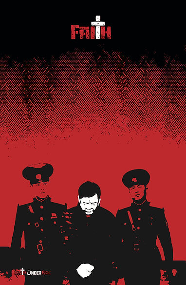
Faith Under Fire: Campaign
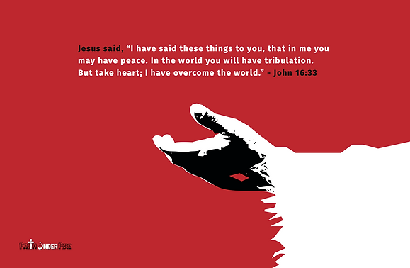
Faith Under Fire is a campaign that calls to remember those who risk everything
for their faith. Through striking visuals and powerful, soul-stirring quotes on posters, and postcards, this movement seeks to open eyes and soften hearts. Each piece is a tribute to the courage of believers who face persecution daily, inviting others to stand with them in empathy, prayer, and solidarity.


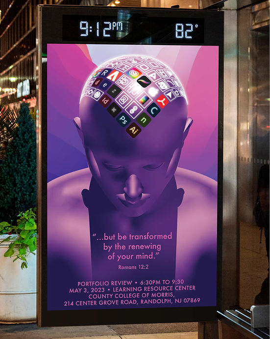
Mind of a Graphic Designer
This poster concept illustration would have promoted the end-of-year Graphic Design Portfolio Review at the County College of Morris. The design centers around a striking purple bust of an androgynous figure, depicted in a contemplative pose, gazing downward. The figure's scalp is creatively adorned with glowing, iconic symbols familiar to graphic designers, symbolizing the tools and concepts that occupy their creative minds.
The background features a generic Apple Mac screensaver, a recognizable nod to modern designers' digital workspaces. Together, these elements capture the essence of graphic design and its deep integration with computer technology. The poster's thoughtful composition and vivid imagery effectively celebrate graphic design students' creativity, innovation, and technical expertise, which would have set the stage for a memorable portfolio review.
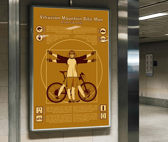
Vitruvian Mountain Bike Man
This infographic creatively educates viewers by reimagining Leonardo da Vinci's Vitruvian Man as a modern mountain biker. The iconic figure is dressed in full mountain biking gear, complete with a helmet, gloves, goggles, and cycling shoes. A mountain bike is positioned behind the figure, fitting perfectly within the classic square and circle that frame the Vitruvian Man.
The poster features a series of icons surrounding the illustration, each highlighting a specific piece of mountain biking equipment. Accompanying text provides concise, informative explanations of each item's purpose, from enhancing safety to improving performance on rugged terrain. This fun yet educational design bridges art and functionality, making it an engaging resource for both cycling enthusiasts and casual viewers alike.
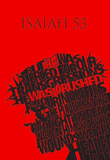
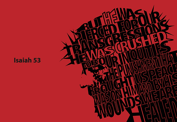
Isaiah 53
This Adobe Illustrator illustration presents a striking profile view of Jesus Christ's face, masterfully crafted using typography. The words forming the image are taken directly from Isaiah 53, the prophetic passage describing the suffering servant. Through the deliberate placement of text, the artwork vividly portrays Jesus wearing a crown of thorns, symbolizing His sacrifice Adobe Illustrator illustration and fulfillment of prophecy.
The thoughtful integration of scripture into the illustration captures both the depth and spirit of Isaiah 53, creating a powerful visual representation of the verse’s profound meaning. This unique piece bridges art and faith, inviting viewers to reflect on the enduring message of redemption and hope.
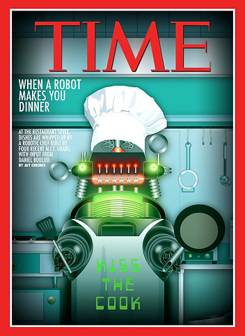
Kiss the Cook
This mock-up illustration created with Adobe Illustrator for a Time Magazine cover creatively and technically captures the theme of an article titled "When Your Robot Makes You Dinner." The story spotlights four MIT graduates who have revolutionized dining with a restaurant
where a robot prepares all the dishes. At the center of the cover is a technical illustration of Robby the Robot from the classic film Forbidden Planet, reimagined in a playful culinary role. Robby is depicted wearing a chef’s hat and an apron that cheekily reads “Kiss the Cook.”
He holds a frying pan in one hand and a spatula in the other, confidently standing in a modern kitchen setting. This humorous and engaging illustration seamlessly blends nostalgia with innovation, making it a captivating and memorable visual that perfectly complements
the futuristic theme of the article.
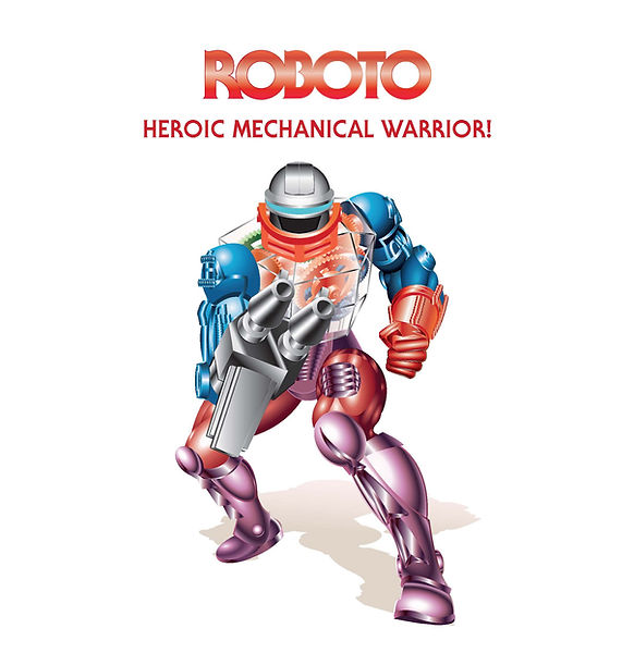
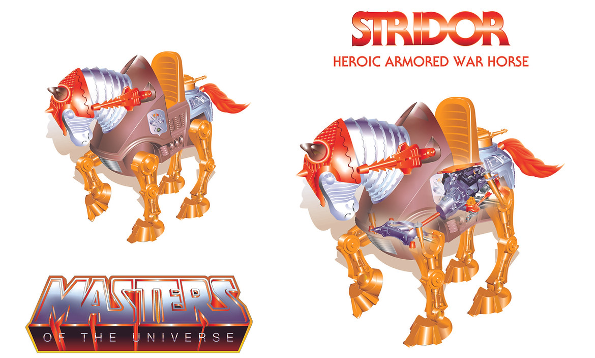
Roboto and Stridor
Two stunning technical illustrations created with Adobe Illustrator, showcase the iconic characters Roboto and Stridor from the Masters of the Universe franchise. These meticulously crafted illustrations capture the essence of the beloved toy line, celebrating its enduring legacy and cultural impact as one of the most successful franchises in history.
The illustration of Roboto highlights his intricate robotic design, featuring detailed gears, circuits, and his signature transparent chest plate, emphasizing his mechanical complexity and futuristic charm. Meanwhile, the depiction of Stridor, the heroic robotic horse, showcases its armored plating, powerful legs, and saddle, bringing out its majestic yet battle-ready demeanor. Both pieces serve as a tribute to the artistry and imagination that defined Masters of the Universe, offering a nostalgic nod to fans while honoring the franchise’s influence on pop culture and the world of toys.
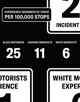
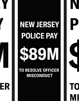
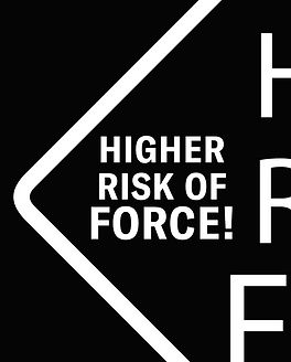
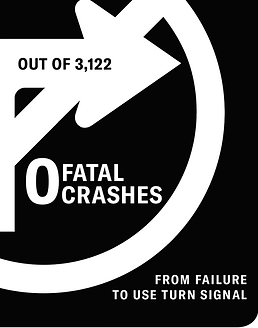
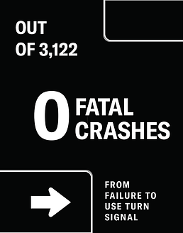
Pretextual Traffic Stops
This campaign employs graphic design to subvert conventional traffic signage and draw attention to the issue of pretextual traffic stops—police-initiated stops often justified by minor infractions but motivated by investigatory intent, disproportionately affecting marginalized communities. Through the visual language of road signs—symbols of order, direction, and authority—the campaign disrupts familiar cues with fragmented, distorted, or recontextualized iconography.
By stripping these signs of their usual clarity and replacing them with abstract, layered messages, the viewer is compelled to reevaluate the neutrality of public space and the
role of law enforcement within it. Positioned in both physical installations and digital media, the signs create a jarring visual intervention that prompts reflection, dialogue,
and civic engagement.


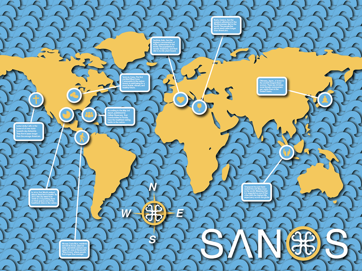
SANOS
Inspired by the Blue Zone brand, which explores the science of health and longevity by studying Blue Zones—regions around the world where people routinely live into their 100s—this concept art and brand identity redesign reimagines the movement with a fresh name and updated visuals. The new design encapsulates the essence of the Blue Zone philosophy, emphasizing wellness, sustainability, and vitality through every element of the brand’s identity.
The rebranding to SANOS captures the core values of promoting a healthier, longer life by connecting with the audience on a deeper level. This poster illustration breathes new life into the brand through thoughtful typography, a vibrant yet calming color palette, and modernized imagery while staying true to its roots in scientific research and community-oriented living.